
Veritas Church
[Full Brand]
In 2024 a presbyterian church called Veritas (truth) approached me to help with their branding. They’re a brand new church plant in the city of Preston and they wanted the way they came across to people to be very much planted in tradition but also have a modern element. I thought that sounded like an interesting project so we worked together!
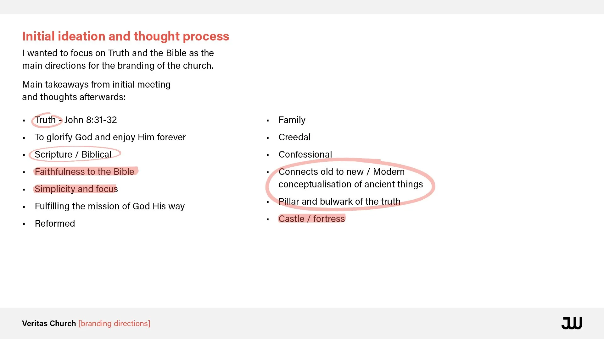
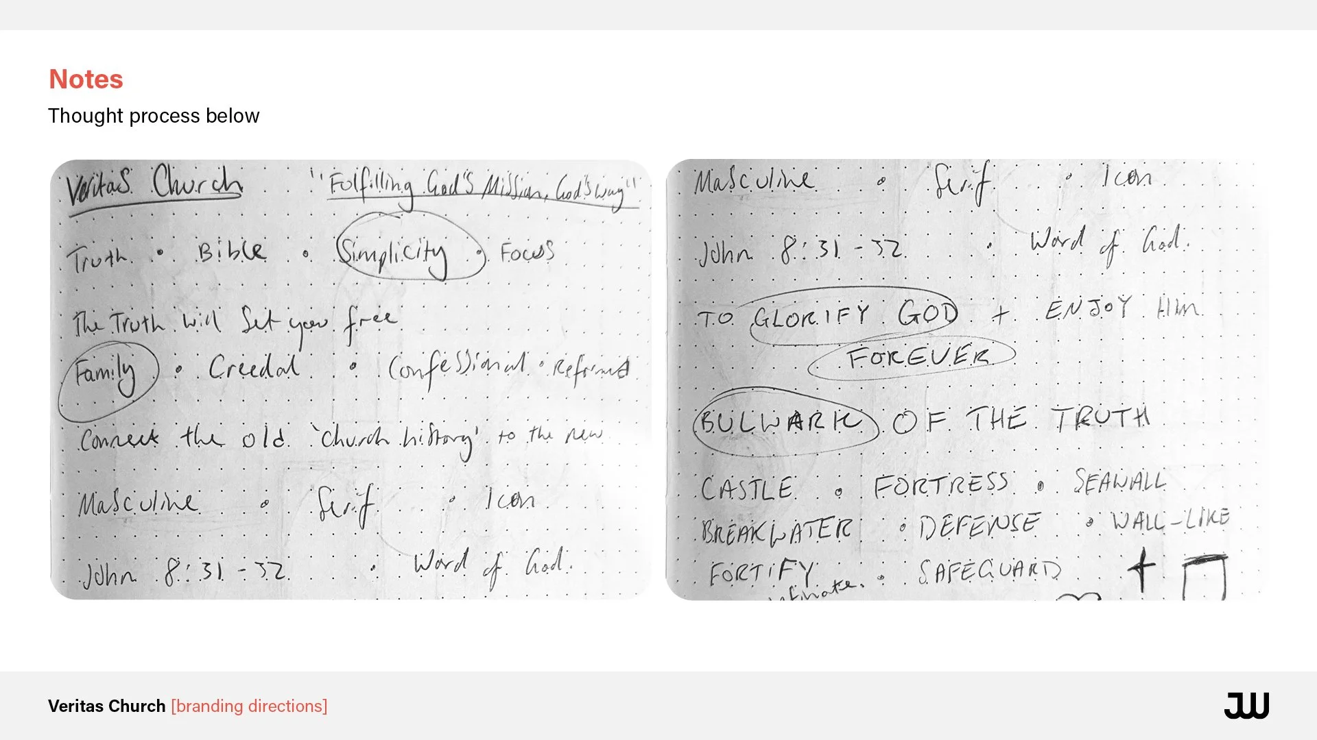
From our initial meeting we scoped out what the church wanted to be, who they were targeting with their message and what the church stands for. Here are some of my thoughts and ideas.
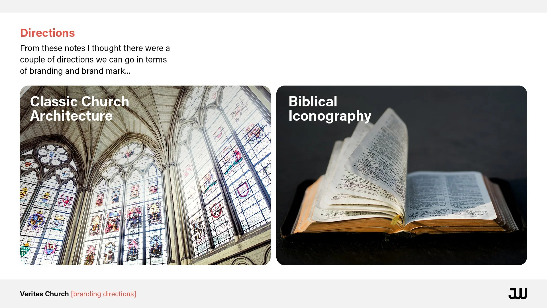
Option 1 - Classic Church Architecture

Option 2 - Biblical Iconography
I then fleshed out the two directions and it started to become clear that classic church architecture was the stronger option.


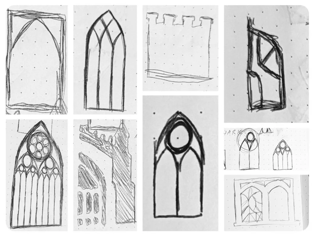
The main inspiration for the logo is the church door that Martin Luther nailed his 95 Theses to on October 31, 1517. The theses criticized the Catholic Church, particularly the sale of indulgences, and sparked widespread debate. This event is often seen as the beginning of the Protestant Reformation.

The logo is arguably the most important part of a brand’s identity so it was crucial we got this right. I wanted a main logo that they could use in most places but also alternative that they could use in different situations so I made them an array to use.
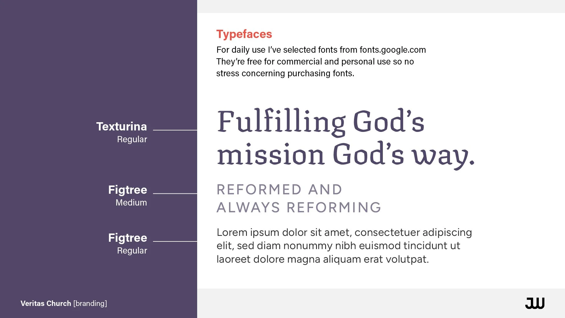
The fonts were chosen to fulfil the brief of being both traditional and modern.
Colours of the brand based on royal colours as well as a nod to Biblical stories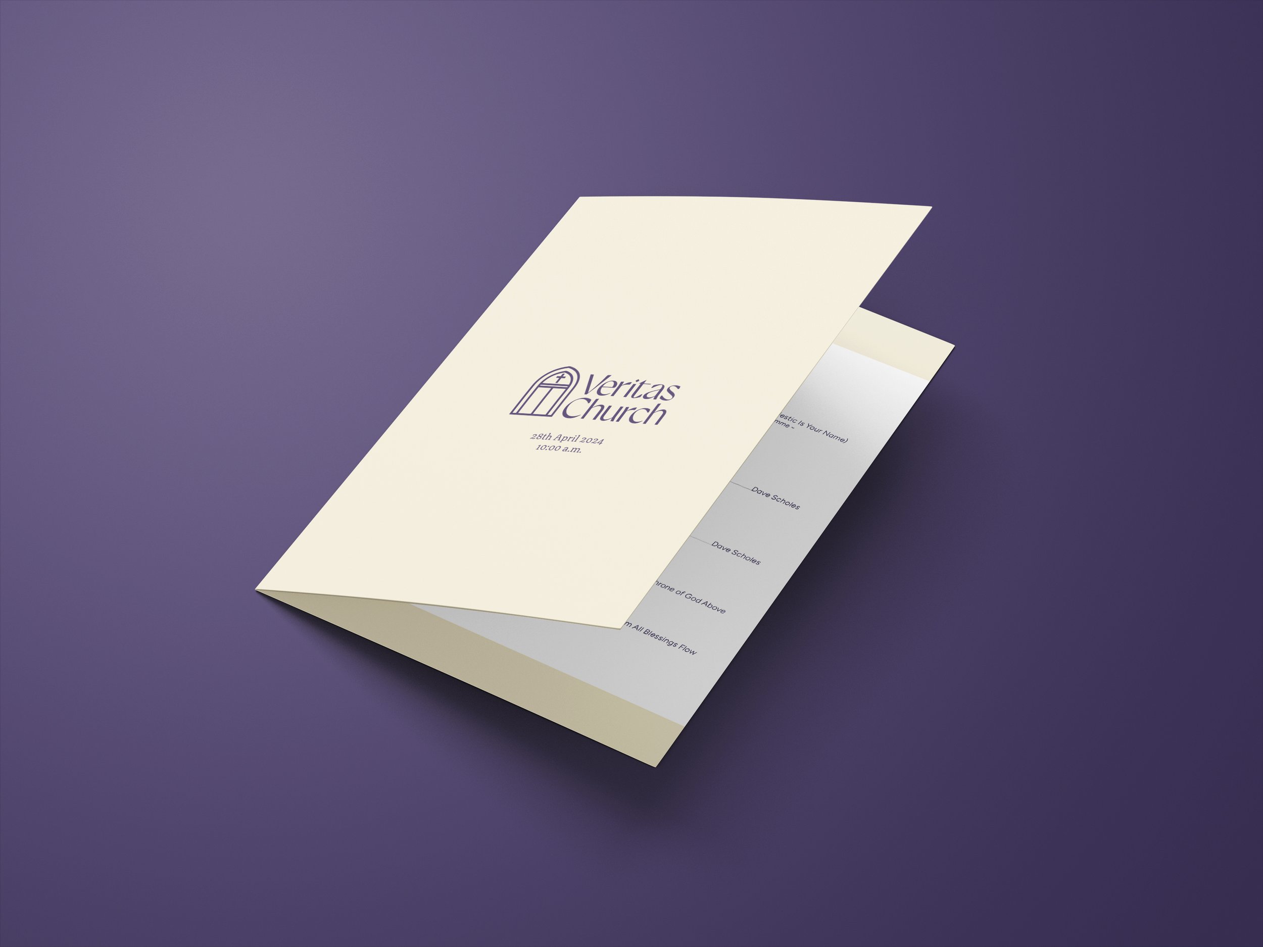
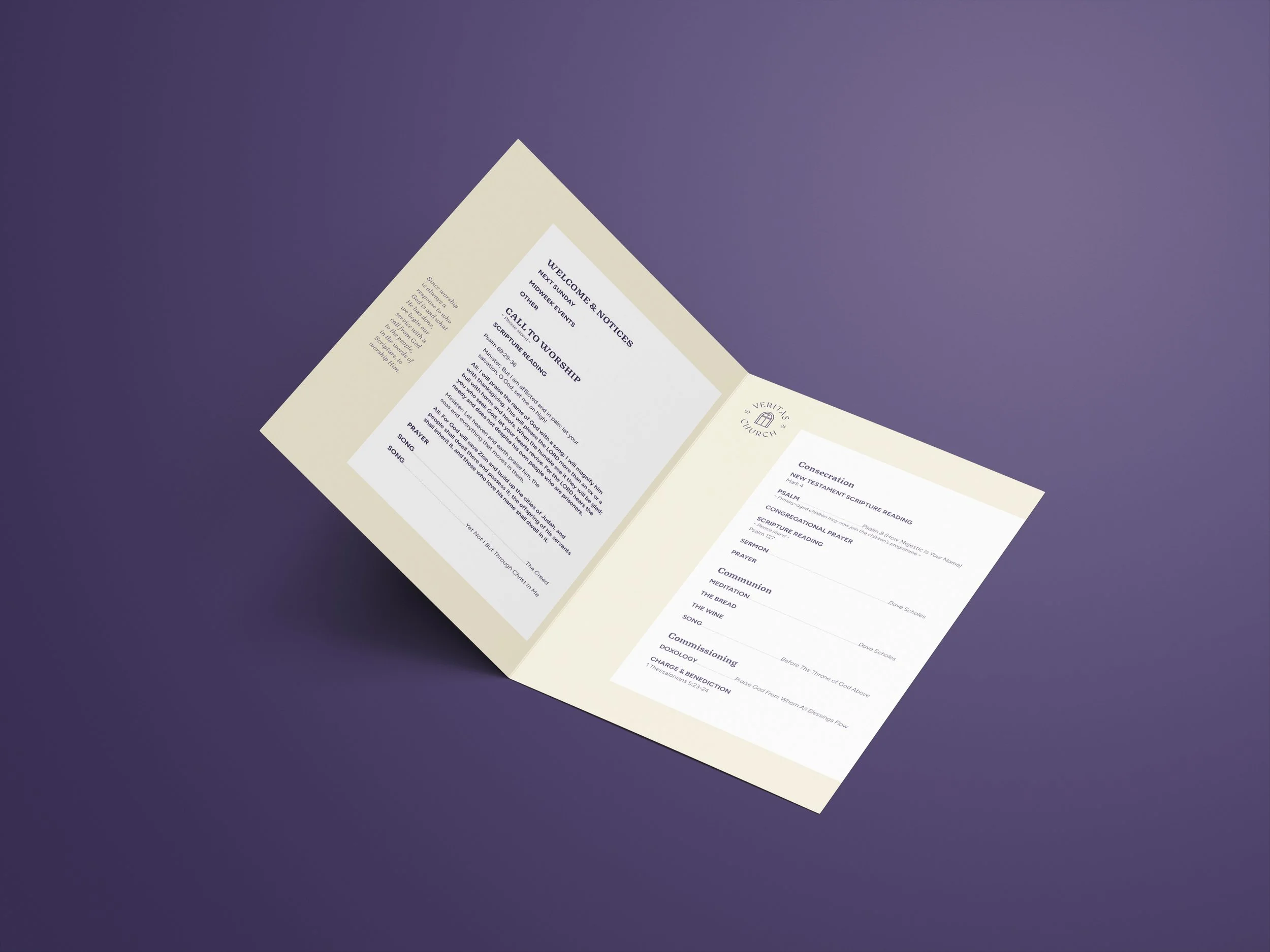
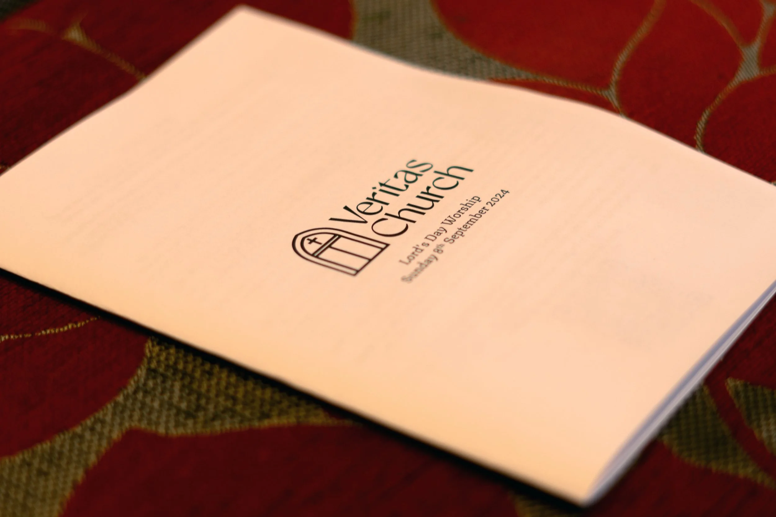
A Sunday liturgy mockup and in situ - they wanted to print it weekly on an office printer so wanted a very limited colour pallet.
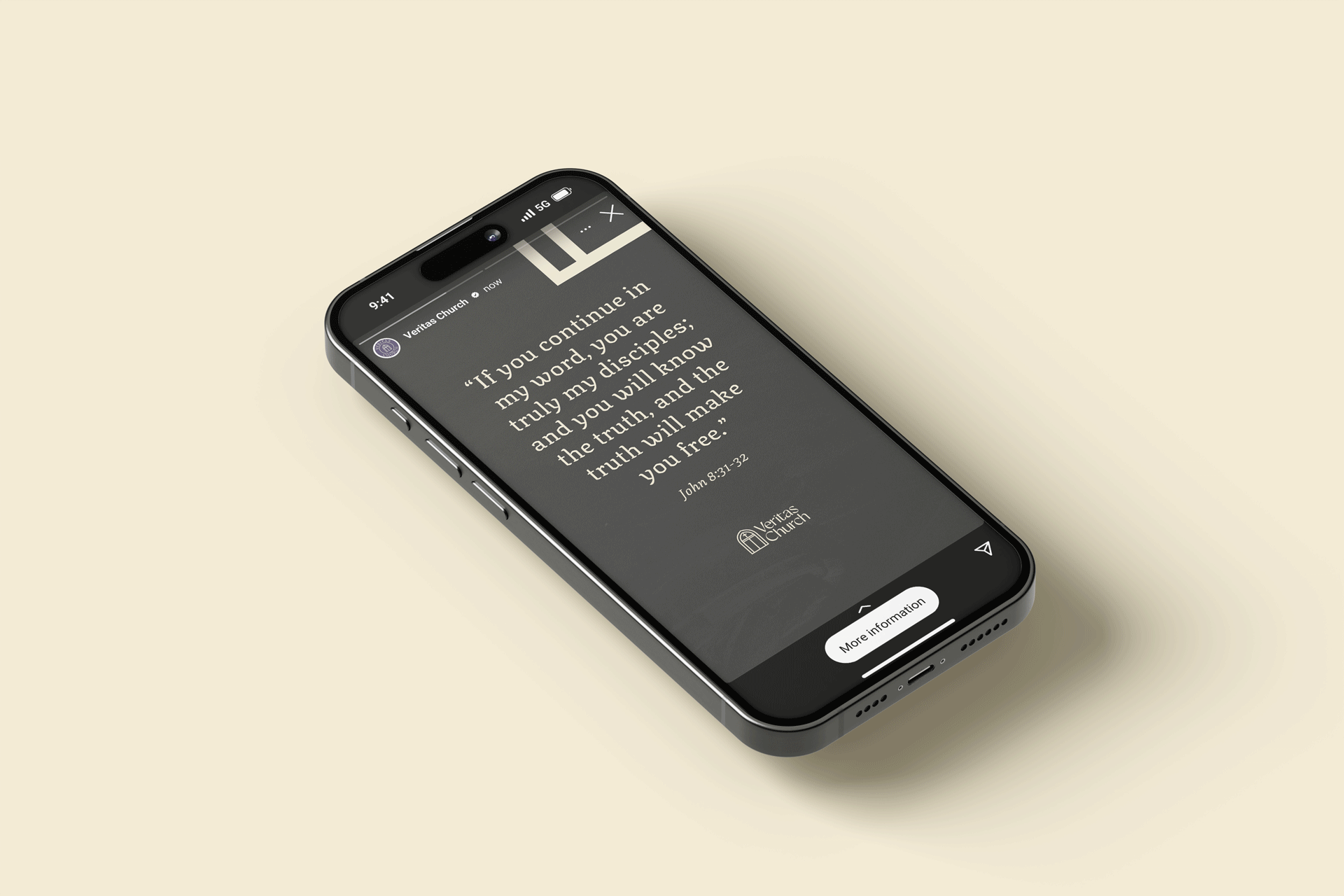

An array of templates for Instagram, their main social media platform.

Flag banner

Swing board
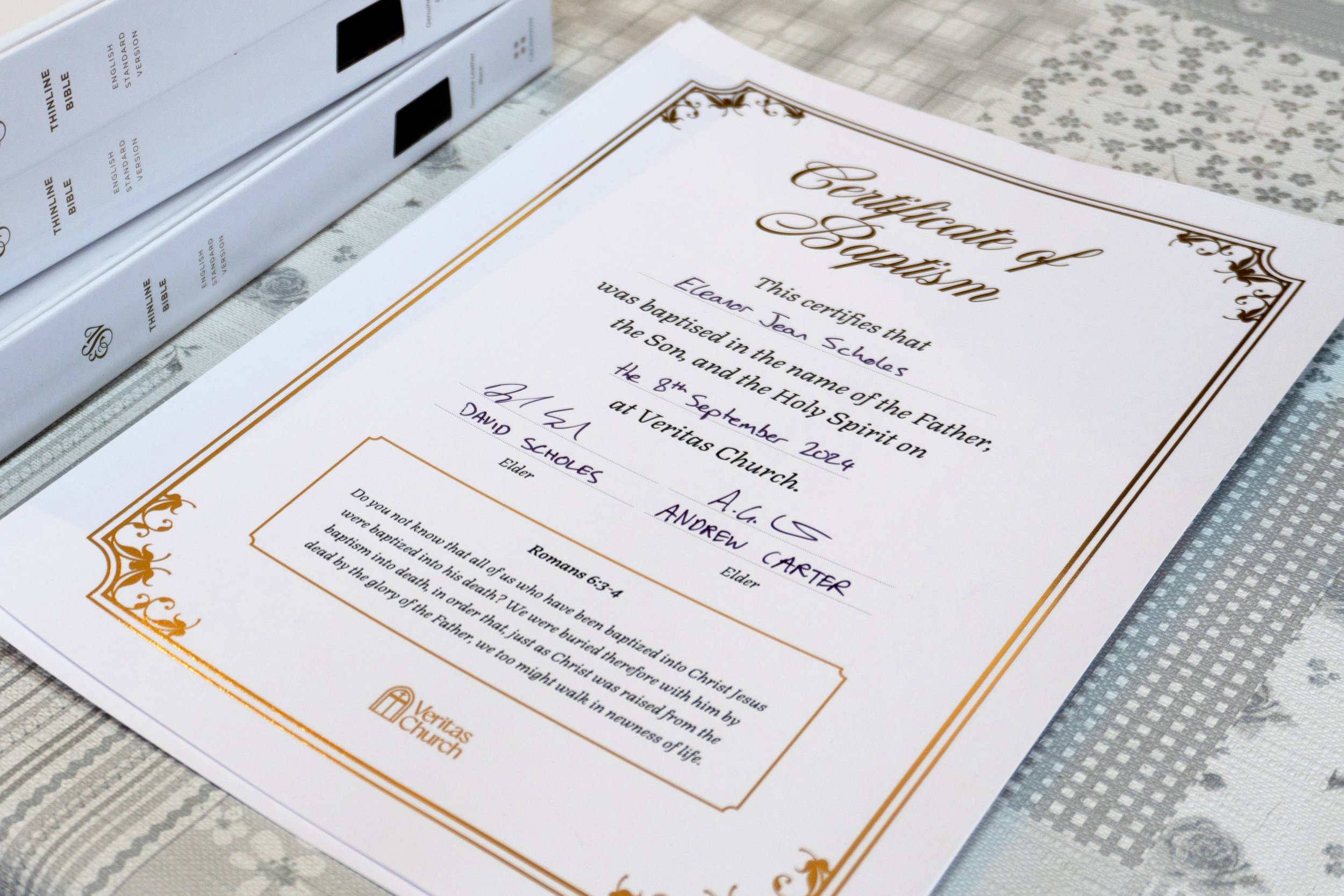
Gold foil baptism certificates
I worked solo on this one!